







Julie García walking through a bamboo forest

Connecting the dots to make change happen

9+ years across FinTech and SaaS, from founding Banco Azteca’s design system to making PayPal’s Design System AI-ready.

About

🖖🏻 Hi, I’m a Strategic Product Designer with 9+ years of experience across FinTech and SaaS, figuring out how to turn complex problems into products, systems, and strategies that work in the real world.

I’ve worn different hats along the way: designing user experiences, building a design system from the ground up, and shaping the strategy and roadmap behind PayPal’s Design System Rebrand. For the past 6+ years, I’ve worked at the intersection of design, research, and product strategy, often stepping into ambiguous spaces where the problem isn’t fully understood yet, let alone the solution.

I gravitate toward the messy, early stages of problem-solving: asking better questions, connecting the dots, and figuring out what’s worth building. Whether that leads to a new product experience, a scalable system, or a different way of working, I care about making things meaningful for people and valuable for the business.

Focus areas

  • Strategy
  • Design Systems
  • Governance
  • Operations
  • People Management
  • Leadership
  • Research
  • AI
  • Wireframing
  • Prototyping
  • Documentation
  • Education

Core principles

  1. 01

    Understand before acting

    We can't solve the right problem without first understanding it.

  2. 02

    Turn ambiguity into strategy

    Design turns complex problems into clear direction and actionable steps.

  3. 03

    Design for systems, not silos

    Build solutions that work together, scale across teams, and solve tomorrow's challenges.

  4. 04

    Make evidence drive decisions

    Use research and data to guide decisions and measure meaningful impact.

  5. 05

    Design for adoption, not just delivery

    A solution creates value only when people can use it, trust it, and make it part of their work.

  6. 06

    Amplify human potential through AI

    Technology should expand what people can do, not add to their complexity.

Experience

BrandRoleYears
PayPalSenior Product Manager, Design Systems2025–2026
Product Manager, Design Systems2023–2025
Banco AztecaDesignOps ManagerFeb–Jun 2023
Design System Manager2020–2023
UX Generalist2019–2020
UXCool AcademyChief Product Officer & Founder2020–2021

Team Leadership: I've led multidisciplinary teams across UX, Research, Content, and Visual Design with direct reports at Banco Azteca, where I ran the Design Ops team, and at UXCool Academy, where I led a team of UX and Visual Designers as their product lead.

At PayPal, I led through influence, coordinating design work across the team and planning its alignment with Engineering.

BrandRoleYears
Design System CampInstructor & mentor2025–Present
Early CareerUX Design, Consultant, branding2016–2019

Brands I worked with throughout my career

  • PayPal
  • Venmo
  • Banco Azteca
  • Befective
  • Claro video
  • Claro música
  • AJ
  • Larousse

Project 01 — PayPal

  • Design Systems
  • Strategy
  • Governance

Building the system behind PayPal’s global rebrand

The problem

PayPal was changing its visual identity globally, but the existing Design System wasn't built to carry that change across iOS, Android, and every team building on them.

I turned it into the infrastructure that made the new brand adoptable, extensible, and measurable.

Process

  1. 01Foundations
  2. 02Coherence
  3. 03Contribution
  4. 04Discover
  5. 05Extension
  6. 06Impact

Case sheet

Client
PayPal
Role
Design Product Manager
Scope
Design Systems · iOS · Android · Consumer · Merchant · Venmo
Strategic priority
One system for all

My contribution

  • Flexible core components built for a broad range of use cases
  • Roadmap and prioritization aligned with Merchant, PP.com, and Venmo needs
  • Contribution framework, intake processes, and team rituals
  • Release processes and a documentation site MVP to drive adoption
  • System health reporting (PODS) and measurement

Impact

The result: scale without sacrificing quality

91%of iOS feature modules run on Design System v6
91.5%adoption across Android
<5%of ~5,400 reported bugs were design-related
90%of those were minor polish, not functional breaks

Remaining exceptions are platform infrastructure, not product UI — near-total coverage where it matters.

See full case

Key decision

Rebuild the foundations, not just the surface

The new brand had to land across iOS, Android, and every team building on them. The question was how deep the system change should go.

  1. Option A

    Re-skin Design System v5

    Apply the new brand on top of the existing architecture.

    The fastest path, but the new identity would sit on a system that wasn’t built to carry it.

  2. Option B · Final decision

    Re-architect into v6

    Foundations, core components, and modules rebuilt for the new brand across iOS and Android.

    Flexible core components for a broad range of use cases, with the roadmap prioritized alongside Merchant, PP.com, and Venmo.

The system behind the rebrand

Foundations and core components rebuilt to carry the new brand across iOS and Android.
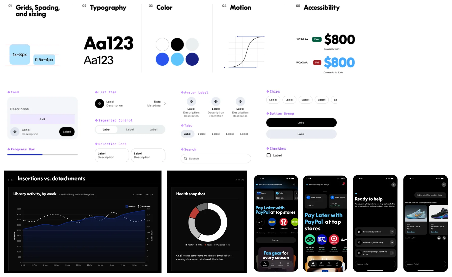
Design System v6 foundations (grids, typography, color, motion, accessibility), core components, library health dashboards, and PayPal app screens
Fig. 01 — Foundations, core components, and product patterns in Design System v6

Project 02 — PayPal

  • AI
  • Strategy
  • Research

From AI experiments to a systematic approach

The problem

Designers across teams were independently experimenting with Figma Make, Claude, ChatGPT, and Cursor, but there was no shared standard for Design System compliance, no common workflow, and no evidence of what actually worked.

Before scaling AI assistance, I needed to understand what was actually working; and what would break at scale.

Process

  1. 01Strategy
  2. 02Baseline
  3. 03Pilot
  4. 04Readout
  5. 05Refinement
  6. 06AI Playbook

Case sheet

Client
PayPal
Role
Design Product Manager
Scope
Strategy, User Research & Stakeholder Coordination
Strategic priority
Make the Design System AI-readable

My contribution

  • Internal AI tool-usage survey across the org
  • MCP rollout on Claude and Replit, narrowed to cross-tool skills
  • Structured pilot: test scenarios, FigJam research diaries, intake profiles
  • Synthesis into a full readout and prioritized fix list
  • DS Intelligence Layer shipped to the DS site, still in beta

Insight

  • The blocker wasn't the system's capability. It was access.
  • The real friction was getting designers into the right tools, workflows, and engineering environments.

Impact

The shift: from unmanaged AI use to a tested, governed layer

4product teams in the structured pilot
60–80%Figma Make → production code accuracy
2leadership asks: a dedicated AI team and a quality standard
BetaDS Intelligence Layer, live on the DS site

Proved the layer works: near-total compliance with a detailed prompt, vs. major corrections on a vague one.

See full case

Key decision

Govern what AI reads, agnostic to any tool

AI tools were spreading across teams with no shared standard. Three paths were weighed at leadership level with the VP.

  1. Option A

    Standardize on one AI tool

    Pick a winner and govern it.

    Fast to roll out, but it locks the org into one tool while tools were changing every few months.

  2. Option B

    Let teams keep experimenting

    No intervention, no upfront cost.

    Output stays ungoverned and inconsistent across products, with no evidence of what works.

  3. Option C · Final decision

    Make the system the input layer

    Design System v6 made AI-readable, with skills that work across tools.

    Tools churn; the system is the constant. The MCP rollout on Claude and Replit was narrowed on purpose to tool-agnostic skills.

Inside the pilot

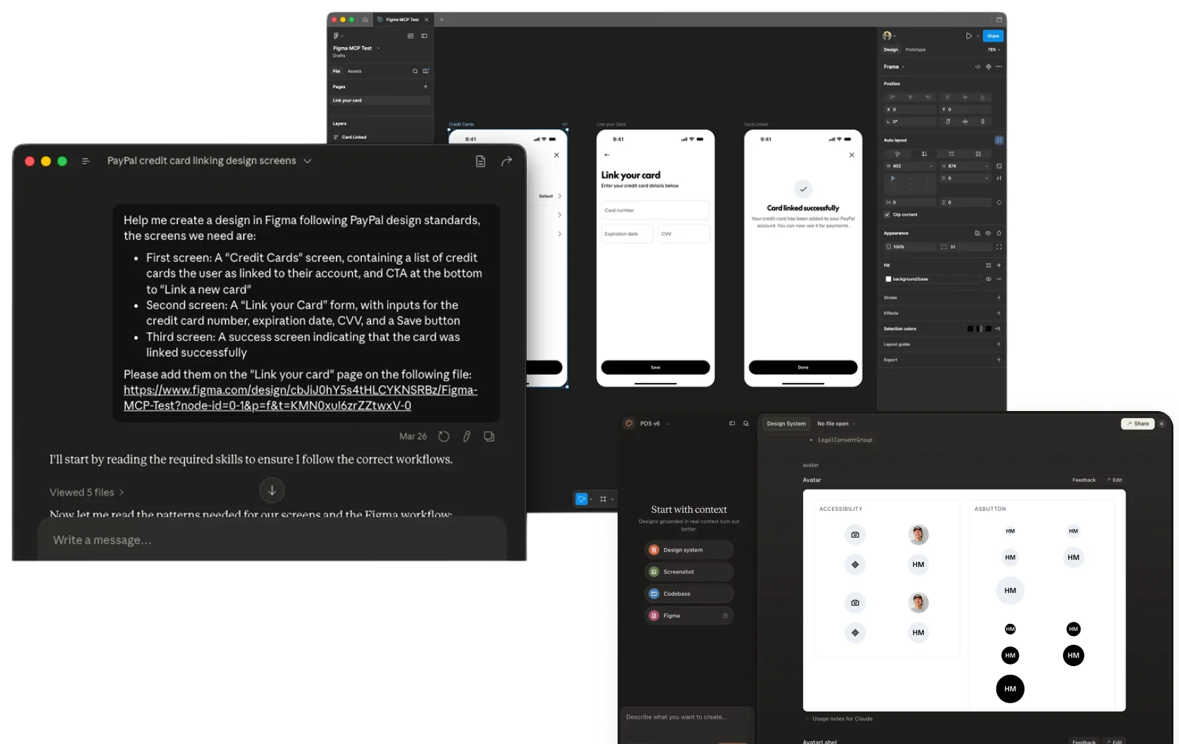
From prompt to screen: DS Skills generating system-compliant flows during the pilot.

A Claude prompt generating PayPal credit-card linking screens in Figma, and the Design System v6 package running in Claude
Fig. 01 — Pilot sessions: prompts in Claude, system-compliant screens in Figma

Project 03 — PayPal

  • Operations
  • Strategy
  • Governance

Designing the operational model

The problem

Design System support had grown organically across channels, workflows, and tools. Teams didn't have a clear path to get help, while the Design Systems team absorbed significant manual effort resolving questions, requests, and implementation issues.

The goal wasn't simply to improve support. It was to understand what was driving demand and redesign the system so more needs could be resolved without one-to-one intervention.

Process

  1. 01Empathize
  2. 02Identify
  3. 03Synthesize
  4. 04Re-frame
  5. 05Prioritize
  6. 06Make success visible

Case sheet

Client
PayPal
Role
Design Product Manager
Scope
Strategy, Operations, Ways of working
Strategic priority
Make Design System impact visible

My contribution

  • Defined the five-capability strategy: Documentation, Self-Service, Automation, AI Assistance, and Measurement
  • Set H2 OKRs and shaped the six-pillar "One System" roadmap, sequencing foundations before AI
  • Redesigned intake and prioritization with a scored, criteria-based model
  • Aligned Design Systems strategy with Merchant, PP.com, and Venmo roadmaps
  • Built the measurement backbone around self-service, adoption, and value

Impact

The diagnosis that reframed the strategy: the bottleneck wasn't execution, it was the front door

85%of requests entered through informal channels
25–35%of forum threads became a trackable ticket
96%completion rate once a ticket existed
53%of triage outcomes went untagged

The shift: from reactive support to a governed system, with a criteria-based front door and a measurement foundation for investment decisions.

See full case

The diagnosis

Where support broke down

Each bar is a different stage of the request lifecycle — the drop happens at the front door, not in execution.

Requests entering through informal channels

Slack, forums, DMs, Office Hours — no real front door

85%

Forum threads that became a trackable ticket

Most requests never made it into the system

25–35%

Tickets resolved once they existed

Execution was never the problem

96%

The framework

From root causes to a scaling strategy

Four root causes became the foundation for a five-capability framework, sequenced into three workstreams that shaped PayPal's H2 Design Systems roadmap.

4Root causes

  • Trust & visibility
  • Intake & routing
  • Knowledge discovery
  • Measurement

5Capabilities

  • Documentation & Knowledge
  • Self-Service
  • Automation
  • AI Assistance
  • Measurement

3Sequenced workstreams

  • 01Close the feedback loop to rebuild trust
  • 02Reduce friction and misrouting
  • 03Build a self-serve knowledge layer

Key decision

Fix the front door before scaling support

Support demand was outgrowing the Design Systems team. I led the call, with my team, on where to invest first.

  1. Option A

    Add capacity

    More people and hours to resolve requests faster.

    Execution wasn’t the bottleneck: 96% of tickets were resolved once they existed.

  2. Option B

    Lead with an AI assistant

    Automate support answers first.

    AI would have scaled the same broken intake. It belonged on the roadmap, after the foundations.

  3. Option C · Final decision

    Diagnose, then fix intake

    Rebuild the front door and close the feedback loop, in three sequenced workstreams.

    85% of requests entered through informal channels. The fix had to start where demand was being lost.

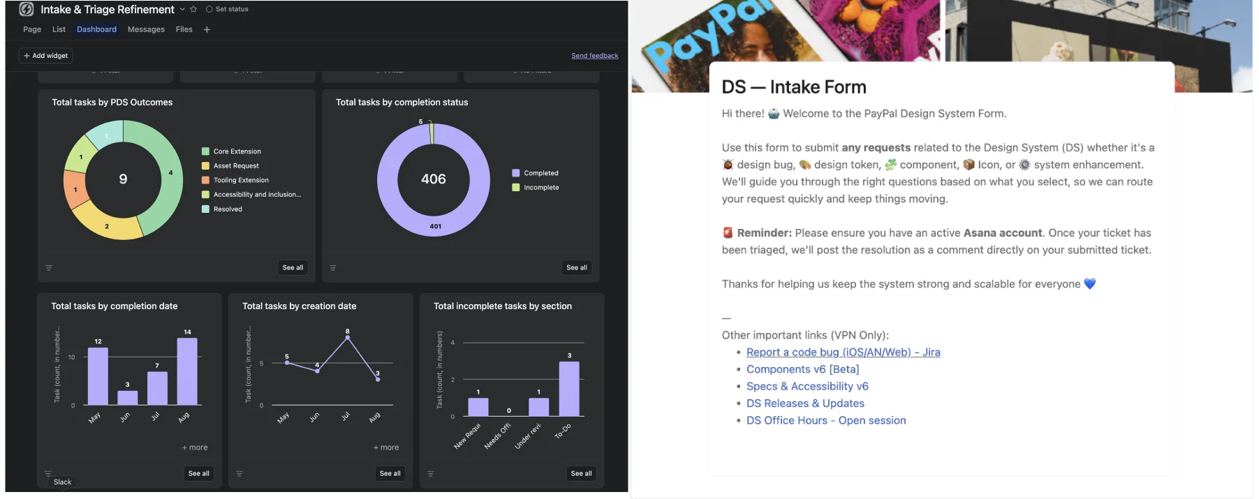
The operational backbone

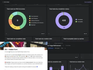
Intake, triage, and support work tracked in one place — where all of the team's operational work lives.

Intake and triage dashboard with task charts, next to the PayPal Design System intake form
Fig. 01 — Recreated from the Asana dashboard used by the Design Systems team

Project 04 — Design System Camp

  • Education
  • Design Systems
  • Leadership

Making Design System impact measurable

The problem

Most design system teams struggle to prove impact, they argue from intuition instead of data, and the system ends up treated as a cost rather than a strategic asset.

I created a course based on my own proven design systems track, that helps teams turn adoption, consistency, efficiency, and quality data into strategic narratives that drive investment and action.

Process

  1. 01Theory
  2. 02Hands on
  3. 03Share out
  4. 04Closure
  5. 05Feedback

Case sheet

Client
Design System Camp
Role
Course author & Instructor
Scope
Instructional design, Education
Format
Live cohorts (up to 20) + on-demand

My contribution

  • Built the curriculum and methodology from the ground up: metrics, frameworks, and storytelling
  • Created practical tools, templates, and exercises teams can apply right away
  • Lead every live cohort end-to-end, with direct, hands-on feedback
  • Teach Governance at Design System Camp: team structure, contribution models, adoption, and strategy

Social proof

  • "Helped me research data in depth and contextualize it to communicate design system benefits to stakeholders." — Jesús Coronel, MercadoLibre
  • "Goes beyond theory or visual design — it's about measuring whether systems actually function." — Barbara Muñoz, HolaFly

Impact

A practical measurement practice design system leaders take back to their teams

20participants max per live cohort, for direct feedback
5.0flagship bootcamp rating (instructor team)
250+bootcamp alumni from MercadoLibre, Rappi, BBVA, Interbank
5weeks in the flagship bootcamp where I teach Governance

Applicable across design system maturity levels, from first-time measurement to ROI-driven organizations.

See full case

Key decision

Learn to measure, not more components

Most design system courses teach how to build one. The gap I kept seeing in teams was proving it works.

  1. Option A

    Another build-a-system course

    Components, tokens, and documentation.

    A crowded space, and it doesn’t address why systems end up treated as a cost.

  2. Option B · Final decision

    A course on measuring impact

    Metrics, frameworks, and storytelling for design system leaders.

    Teams argue from intuition instead of data. Measurement is what turns a system into a strategic asset.

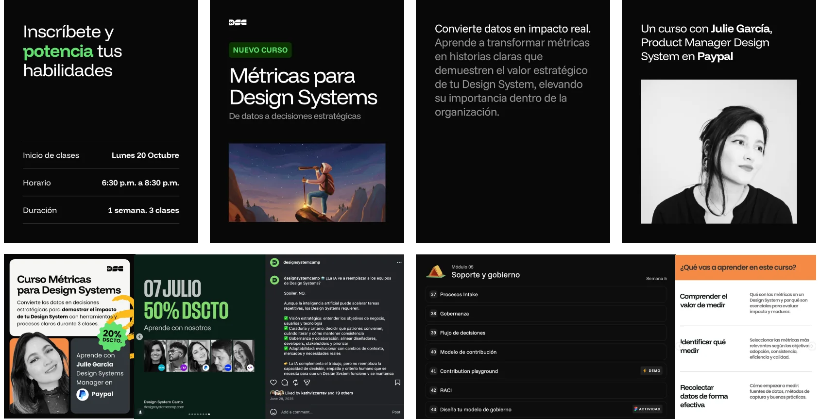
Inside the course

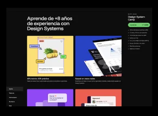
Design System Camp — the course I created and the bootcamp where I teach Governance.

Promotional materials for the Métricas para Design Systems course and the Design System Camp governance module
Fig. 01 — Course and bootcamp materials, Design System Camp

Project 05 — Banco Azteca

  • Research
  • Strategy
  • Wireframing
  • Prototyping

The problem wasn't finding products

The problem

Banco Azteca's app had grown to 40+ banking products, but its architecture had grown around the bank's internal product categories, not around what people actually came to do. Users could check their balance easily, but sending, paying, and collecting money were increasingly hard to find.

The challenge: reorganize the experience around real user journeys without losing visibility of the bank's full product portfolio.

Process

  1. 01Tree test
  2. 02Rebuild architecture
  3. 03Prototyping
  4. 04Validate
  5. 05Refine
  6. 06Build

Case sheet

Client
Banco Azteca
Role
UX Lead and Research
Scope
Research · Information Architecture · Prototyping · Usability Testing
Strategic priority
Rethink the digital bank experience

My contribution

  • Tree test with 60 users to diagnose navigation and mental-model gaps
  • Defined the core user journeys; check balance, send, pay, collect — as the basis for the new architecture
  • Redesigned the information architecture and dashboard structure
  • Rapid prototyping and usability testing across iterations
  • "Hide balance" feature, clearer product cards and iconography, and personalized recommendations

What testing surfaced

  • Users wanted to hide their balance after being targeted for theft — it became a top-priority recommendation.
  • Product icons didn't match users' mental models, driving a full icon and card redesign.

Impact

How research shaped the decisions

60users in the tree test, experts and novices
40+products reorganized around user journeys
4core actions: Check · Send · Pay · Collect

I transitioned off the project before implementation — the outcome is a validated product direction, not shipped results.

See full case

The diagnosis

Where users got lost

Tree test with 60 users, experts and novices: share who found each task in the existing architecture.

Check balance

The one thing that worked

100%

Send money

A core action

40%

Make payments

A core action

20%

Collect payments

A core action

20%

The new architecture

From product catalog to user journeys

Every product in the bank's catalog now hangs off one of four journeys — and testing shaped what changed on the dashboard.

40+Products, by internal category

  • Credit
  • Savings
  • Investments
  • Insurance
  • Accounts & cards

4Journey-based hubs

  • InicioBalance, quick actions, recommendations
  • Cuentas y tarjetasAccounts, cards, credit, savings, investments
  • Enviar · Pagar · CobrarThe three core actions users struggled to find
  • AyudaSupport, security, settings

4Changes validated with users

  • 01Balance check at the top
  • 02"Hide balance" as a top priorityDriven by real safety feedback
  • 03Personalized recommendations
  • 04Clearer product cards and icons

Key decision

Organize around what people come to do, not the product catalog

40+ banking products were arranged by the bank’s internal categories. I led the call, with my team, on how deep the restructure should go.

  1. Option A

    Clean up the catalog

    Rename and regroup the existing product categories.

    Better labels on the same structure, but the tree test showed the gap was the mental model, not the words.

  2. Option B · Final decision

    Journey-based architecture

    Every product hangs off the core journeys: check balance, send, pay, collect.

    A tree test with 60 users, experts and novices, showed where people actually looked for each task.

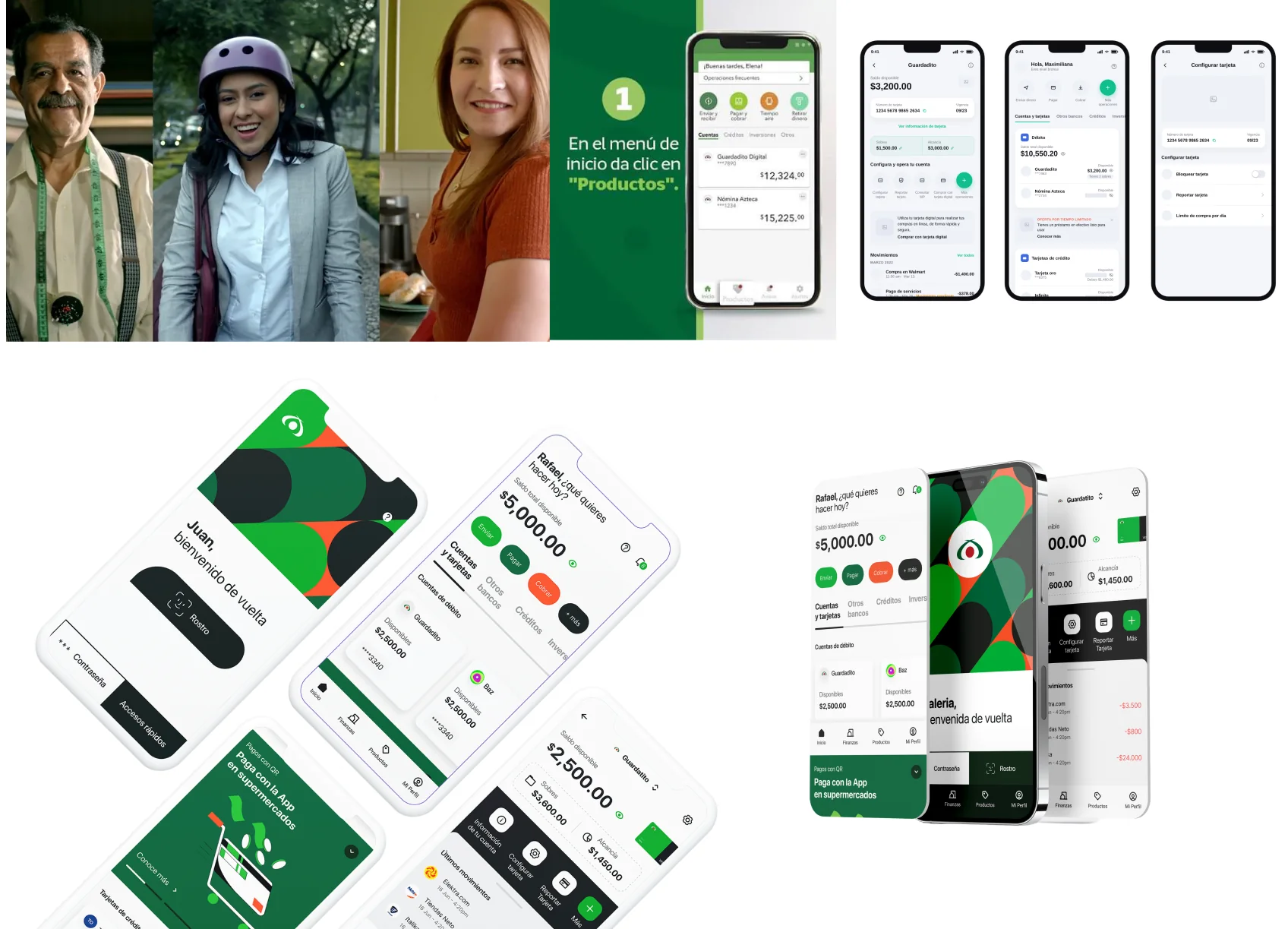
The redesigned experience

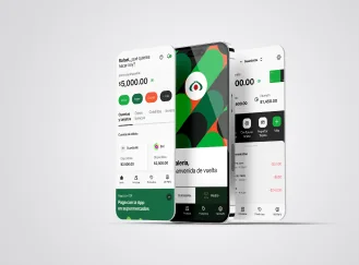
Wireframes, the new journey-based dashboard, product cards, and recommendations — validated with users.

Banco Azteca app: campaign imagery, wireframes, and the redesigned journey-based dashboard on phones
Fig. 01 — App 3.0 Baz: wireframes, architecture, and concept

Project 06 — Banco Azteca

  • Operations
  • People Management
  • Governance

Standardizing how design works

The problem

As the team scaled across pods and projects, every team had its own way of working; no shared process, clear checkpoints, or definition of done. The result: inconsistent collaboration, gaps between design and delivery, and quality that depended on who was on the project.

The challenge: create a shared operating model without slowing teams down.

Process

  1. 01Culture
  2. 02Process
  3. 03Standards
  4. 04Impact
  5. 05People
  6. 06Make it stick

Case sheet

Client
Banco Azteca
Role
Design Operations Lead
Scope
UX · Research · Content · Visual Design
Strategic priority
Design as a repeatable practice, not a collection of individual habits

My contribution

  • Defined a shared six-stage design process mapped to sprint cycles
  • Established team purpose, values, rituals, and ways of working
  • Standardized briefs, research outputs, specifications, handoffs, and quality gates
  • Built a three-pillar roadmap connecting process, collaboration, and impact
  • Led a 7-person multidisciplinary team across UX, research, content, and visual design

Framework

  • Grounded in NN/g's Design Operations framework, orchestrated through Lean UX.
  • Roles, rituals, artifacts, and quality expectations made consistent across disciplines.

What changed

A shared operating model replaced team-by-team ways of working

7direct reports across UX, research, content & visual design
6stages in the shared design process
3OKR pillars driving the roadmap

One repeatable process adopted across design pods — and research became an explicit input to planning and decision-making.

See full case

The process

One process, six checkpoints

Grounded in NN/g’s Design Operations framework and run through Lean UX, mapped onto sprint cycles — with clear objectives and mandatory deliverables at every stage.

  1. 01

    Understand

    Research the problem before solving it

    Deliverables

    • Research plan
    • Personas
  2. 02

    Define

    Frame the problem and what success means

    Deliverables

    • Design brief
    • Journey maps
  3. 03

    Design

    Explore, then converge on a solution

    Deliverables

    • Wireframes
    • Design system components
  4. 04

    Test

    Validate with users before building

    Deliverables

    • Prototypes
    • Usability tests
  5. 05

    Implement

    Hand off without losing quality

    Deliverables

    • Specs & hand-off
    • Quality gates
  6. 06

    Measure

    Prove impact and feed the next cycle

    Deliverables

    • Quality checklists
    • Shared findings

↺ Measure feeds the next Understand — findings shared with stakeholders every cycle

The operating model

From culture to a practice that scales

A culture the team defined together, a roadmap with OKRs across three pillars, and a seven-person team running on one model. Culture Design Canvas by Fearless Culture.

4Culture Design Canvas

  • PurposeWhy the team exists
  • ValuesWhat we hold each other to
  • RitualsDesign Critiques, Design Weeklies
  • NormsConflict, feedback, psychological safety

3OKR pillars

  • How we get our work doneShared process and mandatory deliverables
  • How we work togetherRituals, critiques, and collaboration norms
  • How we create impactResearch in scrum ceremonies, one study per cycle

7Direct reports

  • 01UX ManagerWith 2 direct reports of her own
  • 02UX Researcher
  • 032 Content Designers
  • 042 Staff Designers
  • 05Visual Designer

Key decision

One shared process, defined with the team

Every pod had its own way of working. I led the call, with my team, on how to make one practice stick.

  1. Option A

    Mandate it top-down

    Publish a process and enforce it.

    Fast to announce, but compliance without ownership fades once no one is checking.

  2. Option B

    Let each pod keep its own way

    Share deliverables only.

    Keeps autonomy, but no shared checkpoints or definition of done.

  3. Option C · Final decision

    Co-defined culture + one process

    Purpose, values, and rituals defined together, plus six stages with mandatory deliverables.

    Grounded in NN/g’s DesignOps framework and run through Lean UX, mapped onto sprint cycles.

The team behind the practice

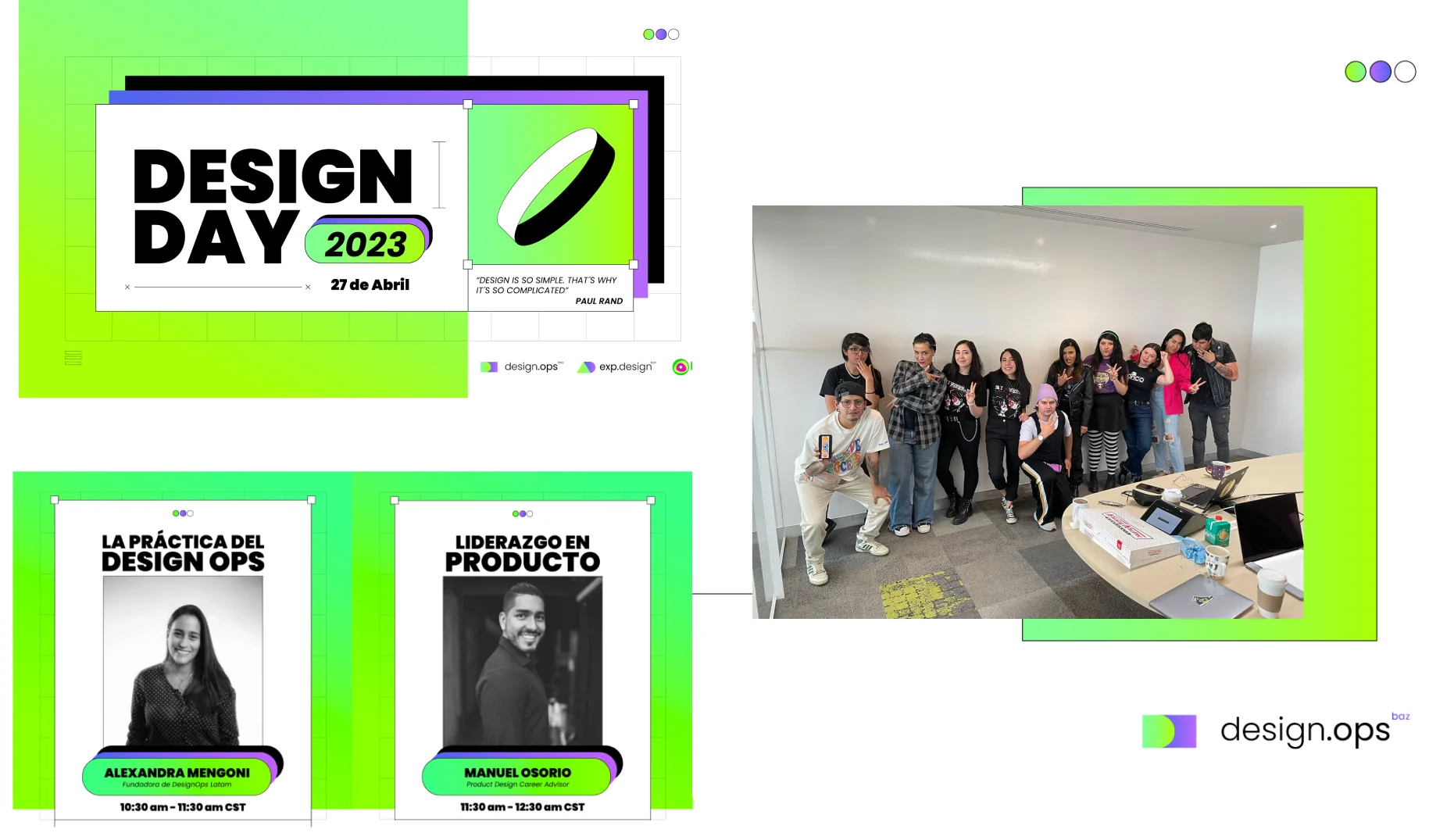
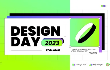
Our first UX Design Day, 2023 — the operating model as something the team celebrated, not just followed.

UX Design Day 2023 key visual, speaker posters, and a photo of the Banco Azteca design team
Fig. 01 — UX Design Day 2023, Banco Azteca design team

Project 07 — Banco Azteca

  • Design Systems
  • Governance
  • Leadership
  • Documentation

Sarape: Building Banco Azteca's Design System

The problem

Banco Azteca's teams were growing faster than their process could keep up with, building app, web, and ATM experiences with no shared source of truth, and close to 80% technical debt in the app's UI alone.

The challenge: replace that fragmentation with one system flexible enough to serve App, web, and ATMs, and a governance model strong enough to make adoption mandatory, not optional.

Process

  1. 01Audit
  2. 02Strategy
  3. 03Execution
  4. 04Principles
  5. 05Scale
  6. 06Measure

Case sheet

Client
Banco Azteca
Role
Design and Product Strategist
Scope
Design Systems · Governance · DesignOps
Strategic priority
One system across every digital experience

My contribution

  • Design system strategy and stakeholder alignment across Engineering, Marketing, Legal, and UX
  • Centralized governance model and team structure
  • Design principles (F.R.E.C.S.) and system vision
  • MVP definition, component library, and design tokens
  • Code-level adoption and an organization-wide adoption program

Impact

The result: from a fragmented app to the bank's shared system

50%reduction in technical debt within 6 months
8.5NPS across the organization
+10Mdownloads across Android & iOS
4.8store rating · #4 finance app in Mexico

2.3 versions of the system shipped, scaling from App to web and ATMs.

See full case

The diagnosis

Eighty percent of the UI was debt

A UI audit of the app mapped 376 components before a single new one was designed — and set the baseline adoption was measured against.

Technical debt in the app’s UI

Duplicated, inconsistent modular patterns

~80%

Audited components replaceable by one

Every team solving the same problem differently

79%

Debt reduction after adoption

Within the first 6 months of Sarape

50%

The adoption engine

From principles to a system people adopt

Five principles defined with designers, developers, and POs; a three-part adoption program; and three planning increments, each with a number behind it.

5Principles · F.R.E.C.S.

  • Funcional
  • Reusable
  • Estético
  • Consistente
  • Simple

3Adoption pillars

  • EducateWeekly DS JAMs with UX, QA & Frontend
  • ReviewMandatory design reviews, every sprint
  • SupportNewsletters, version notes, workshops

3Increments, 2021–2022

  • 0114 workshopsPI 3 · 2021 — introducing the system
  • 0252 DS JAMsPI 4 · 2021 — adoption as a dependency
  • 0353 flow reviewsPI 1 · 2022 — ensuring the system is used

Key decision

Make adoption a dependency, not a suggestion

Close to 80% of the app’s UI was technical debt, and teams were solving the same problems differently. I led the call, with my team, on how to drive adoption.

  1. Option A

    Optional adoption

    Publish the system and let teams opt in.

    Debt keeps growing while teams keep shipping their own versions.

  2. Option B · Final decision

    Adoption as a dependency

    Mandatory design reviews every sprint, from PI 4 · 2021.

    Backed by weekly DS JAMs with UX, QA & Frontend, plus newsletters, version notes, and workshops.

One system in use

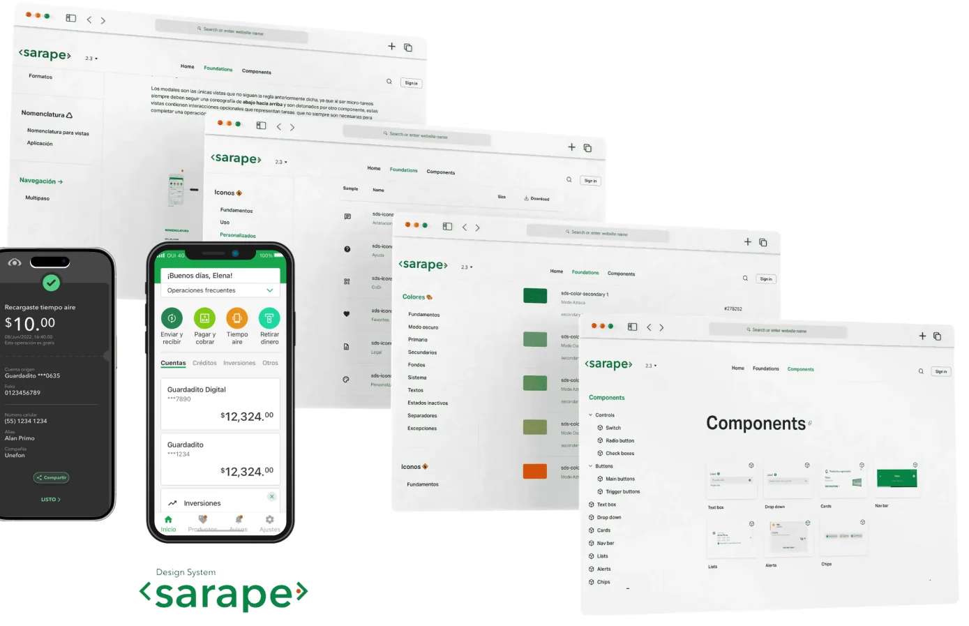
Sarape's documentation site — the shared source of truth for App, web, and ATMs.

Sarape documentation site pages for foundations, icons, colors, and components, with app screens built on the system
Fig. 01 — Sarape documentation site

Let’s work
together

Julie García

+52 55 6509 9668

linkedin.com/in/jgb23

Open to remote roles · Mexico City (UTC−6)

Download CV